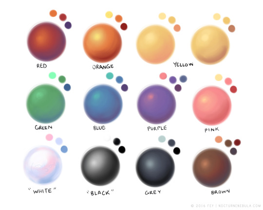
hey yall its me the Art Mom™ to help you shade pretty
rule 1: DO NOT SHADE WITH BLACK. EVER. IT NEVER LOOKS GOOD.
- red– shade with a slightly darker shade of purple
- orange– slightly darker and more saturated shade of red
- yellow– i think like..a peach could work but make it a really light peach
- green– shade with darker and less saturated shade of blue or teal
- blue– shade with purple
- purple– a shade thats darker than the purple you’re using and maybe a little pink (MAYBE blue)
- pink– darker shade of red
- white– a really light lavender or blue..or i guess any really light colour??
- black– okay listen dont use pure black to colour anything unless you want to leave it with flat colours because you cant really shade black lol
- grey– a slightly darker shade of purple or blue (less saturated)
- brown– slightly darker and less saturated shade of purple or red
aaaaand thats all i got lol. let me know if there is anything i should add to this list!!
If you’re a visual learner…
I made some Balls of Colour to go with Art Mom™’s post:
Category: Uncategorized
ppl who say they’re “brutally honest” are more interested in the brutality than the honesty
Where is your compassionate honesty?
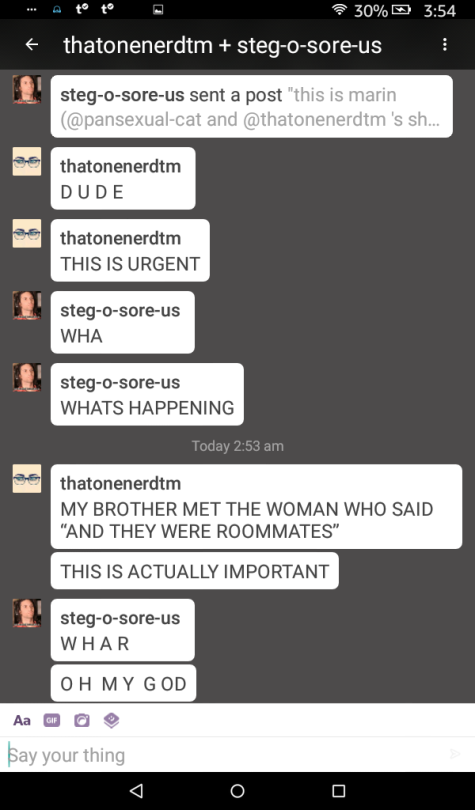
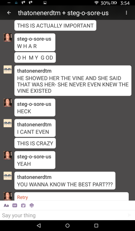
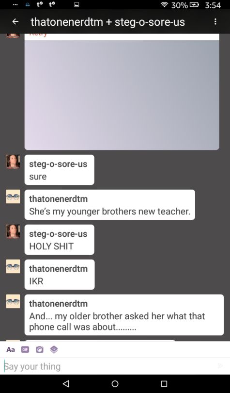
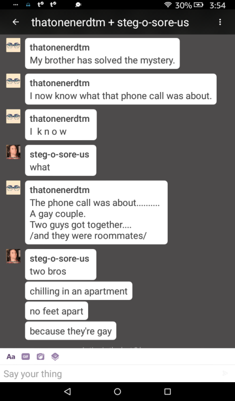
THEY WERE ROOMMATES!!
what not to say to trans people
“but i loved [deadname]!”
“eh, i’ll probably forget so i’ll just keep calling you [deadname/old pronouns] lol”
(to afab people) “but your long hair was so pretty!”
“but you were so pretty/handsome as a girl/boy!”
“but you’re so [insert gender role/sexist stereotype here]”
(to trans wlw and mlm)“but wouldn’t it be easier to say you’re cishet?”
et cetera
y’all pray for my homie franklin, ain’t nothing wrong with him he just sound like chewbacca and got a snaggletooth
He’s so precious. I cry
That snaggletooth is SO PRECIOUS OML

the biggest dpp flaw and injustice was only allowing the approved “cute” pokemon to follow you around in that little park area
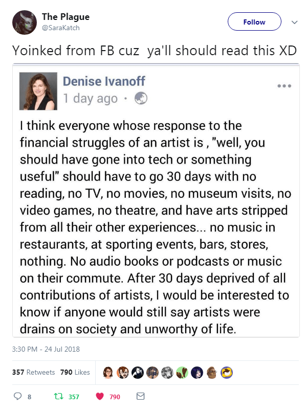
READ IT REBLOG IT PREACH IT
Say it louder
Reblogging on main because this is important.
anxiety brain: IM GOING TO DIE ALONE AND UNCARED FOR
the other side of my brain which is wearing a hawaiian shirt: [cracks another sparkling water] yeah probably

Out on the town !
oh my god
oh my god
oh my god
oh my god
oh my god

