Texturing is a technique that involves
adding local shading and details on surfaces to better represent the
material of an object.
This technique is of course closely linked to shading in general. This is usually applied after defining a global shading.
From left to right :
Lineart
Global shading
Completed sprite
One of the big differences between global and local shading is homogeneity. The
very principle of global shading is to give a sufficiently contrasting
effect between the shaded and lit areas to bring out volume and depth.
Conversely,
a texture must be as homogeneous as possible. It must be able to be
applied on large, uniform surfaces, without making it look bad.
2. Applying a texture
A
texture being homogeneous in terms of its luminosity/contrast, if it is
applied to an object without taking into account the global shading, we
will lose any effect of volume and depth.
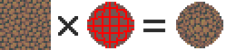
A texture applied to a sphere without shading. Only the deformation of the texture can give us a clue on the shape of the object, but it is still difficult to discern.
Homogeneous contrast
When applying a texture to an object, shadows must also be taken into account. It
is therefore important to maintain a uniform contrast between colours. A
dark line separating a light zone from a dark zone should not keep the
same colour between these two zones.
The color of the line will be lighter on the lighter side and darker on
the darker side to preserve its contrast with the background.
In
the same way it is possible to apply a texture or pattern on a shaded
object, by proceeding to a simple color shifting in our palette.
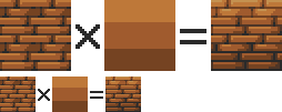
Combination of a texture (left) and an object that is not textured but shaded (middle).
3. Local shading
Since shading is used to highlight the bumps, there are generally two possible cases:
A groove
A bump
Each of these cases can be more or less accentuated by playing on the colors, the intensity of shadows and lights.
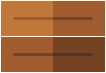
On the upper line, troughs ranging from the weakest to the strongest bumps. On the second line, these are bumps that stand out.
The
mastery of these light bumps is very important, it is the basis of the
textures, and will make it possible to manage all the simple cases, such
as wood or matte plastic.
Example of application on a simple object:
4. Reflections
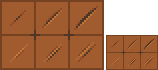
The application of a reflection is done in a
simple way, by applying diagonal strips of light of varying
thicknesses, and following a few rules.
A trough or bump will create an offset at the reflection level (proportional to the height change). As
for the shadows, there is no absolute, depending on the palette or the
material represented, it is possible to lighten or not the area at the
reflection level. It is also important not to have parallel light bands on faces that are not oriented in the same direction, as on this cube:
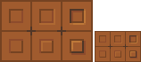
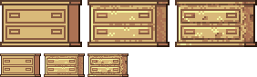
Concrete example of the application of a gold texture on our drawers:
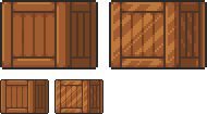
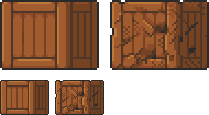
Or, added reflections on our previous crate:
5. Dithering and granularity
Dithering consists in
creating a new false color from a checkerboard or other regular pattern
of two colors close enough to give an illusion of mixing. The closer
the colours are, the stronger the illusion will be. The more the colours
are contrasted, the stronger the granularity effect will be.
Dithering is basically used to obtain fake intermediate shades on
limited palettes, but it is also very useful for making complex and
rough textures.
Example of complex dithering separating 3 colors over a wide area.
The nature of the pattern totally changes the roughness aspect.
Example of the application of a sandy rock on our drawers:
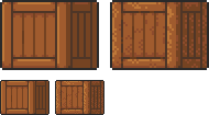
Or add grain to our crate:
6. The art of destruction
The more complex a texture is, the more it will combine fundamental techniques such as bumpiness, reflections or granularity. However, some materials need to go further, by cutting, slash or breaking the base support.
Cuts It works much like bump, but on a much finer surface. We are subject to the same rules, of which here is a summary image:
From the finest to the most pronounced, on the first line of the cuts, and on the second of the bumps.
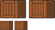
A concrete example on our crate:
Exercises
Since nothing beats practice to learn, here is a series of examples from the simplest to the most complicated.
For each exercise resolved, post your results.
Mastering tools
Add
a strong bump on the text of this image, except the ‘x’ which must be a
groove (the center must be dug more strongly than the rest of the ‘x’):
Palette:
Add reflections on the image obtained between the two red lines shown below:
Now cut and break the letter ‘e’ as well as possible.
Add grain to the letter ‘l’.
Finalize a sprite
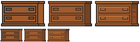
Texturize/colorize this sprite:
Palette:
Add reflections on the inside of the doors to give the impression that there are windows.
Add damage (cuts etc) on the right side of the wardrobe.
Make a variant of this cabinet by redoing it in gold using the palette of the gold drawers example in the tutorial. Palette:
Honestly, it’s so bizarre looking at Nintendo’s two biggest badasses side-by-side.
6-foot intergalactic mercenary. Armed to the teeth, incredible athleticism, can run and jump in full-body armor at lethal velocities. Regularly combats nigh-invulnerable apex predators that completely suck the life force out of everything in the universe in one touch. Typically only rivaled by two things: an armored space dragon, and herself.
8-inch soft boy. Determined, round, makes superpowers out of his food. Regularly combats godly and godless abominations alike. Befriends most of his rivals because they know he wouldn’t have a problem shutting them down if they acted up again. Once helped the first badass take down several of the aforementioned nigh-invulnerable apex predators. They’re friends.
Let’s also not forget that Kirby canonically LITERALLY has infinite power.
Kirby is a badass man. A squishy smooshie wee adorable ball of love badass
apparently controversial fucking opinion: some of us need closed captions/subtitles to understand what is being said in a video and don’t want to see fan transcribers demolishing captions with zalgo text or giving their own commentary/cracking stupid jokes when we turn those on
i promise your jokes/theories/fucking leet speek for some reason can stay in the comments and not in the captions where i have to keep rewatching the video to figure out if that’s actually being said or not
stop putting your own jokes/commentary on what’s being said in the video!
if the video is silent while someone is doing something, there are no needed captions! stop putting weird summaries of what’s happening visually!
i guess i can technically read these yes but holy shit it’s annoying cut it out
i’m glad you suddenly realized captions support stylized text but stop using it, neither of those words had any spoken emphasis on them and this stuff only makes it harder to read captions at a glance
and that’s what captions are for- i need to be able to glance at them so i can continue to watch the video while i know what’s being said. i don’t know what’s being said if they’re cluttered with your unnecessary jokes, and i can’t glance at them and call it good if they’re stylized or written weirdly or full of emoticons and stuff.
I have ADHD and also need captions to fucking process what’s being said sometimes.
Hey all you lovely people who have periods, the world is starting to look a little bit brighter now that certain tampon/pad companies have started to allow people to receive small kits and samples of pads, maxi pads, liner, and tampons for free. And I mean 100% free and discreet. You just have to give them your address and name, and bam! You’ve got all the menstrual cycle products you could ever need for no cost. Links below!